Principles of bot design
By learning the concepts described in this section, you'll become equipped to design a bot that aligns with best practices and capitalizes on lessons learned thus far in this relatively new arena.
The rise of artificial intelligence (AI) continues to drive changes in how enterprises innovate and communicate their business. But for the humans and consumers interfacing with products affected by this technology, what will an AI-empowered future look like? What will it feel like? Empowered by rapidly advancing machine intelligence, product designers are rethinking the fundamental principles that guide the way they work.
The SnatchBot platform enables businesses and developers to create ChatBot experiences that solve a variety of business problems. By learning the concepts described in this section, you'll become equipped to design a bot that aligns with best practices and capitalizes on lessons learned thus far in this relatively new arena.
1. Building a bot
If you are building a bot, it is safe to assume that you are expecting users to use it. It is also safe to assume that you are hoping that users will prefer the bot experience over alternative experiences like apps, websites, phone calls, and other means of addressing their particular needs. In other words, your bot is competing for users' time against things like apps and websites. So, how can you maximize the odds that your bot will achieve its ultimate goal of attracting and keeping users? It's simply a matter of prioritizing the right factors when designing your bot.
Users interact with your application through the user interface that you implement. For example, A simple chat window or a mobile app, or even a robot with a voice interface.
2. The chatbot's first user interaction
First impressions matter
The very first interaction between the user and bot is critical to the user experience. When designing your bot, keep in mind that there is more to that first message than just saying "hi." When you build an app, you design the first screen to provide important navigation cues. Users should intuitively understand things such as where the menu is located and how it works, where to go for help, what the privacy policy is, and so on. When you design a bot, the user's first interaction with the bot should provide that same type of information. In other words, just saying "hi" won’t be enough.
Language versus menus
Consider the following two designs:

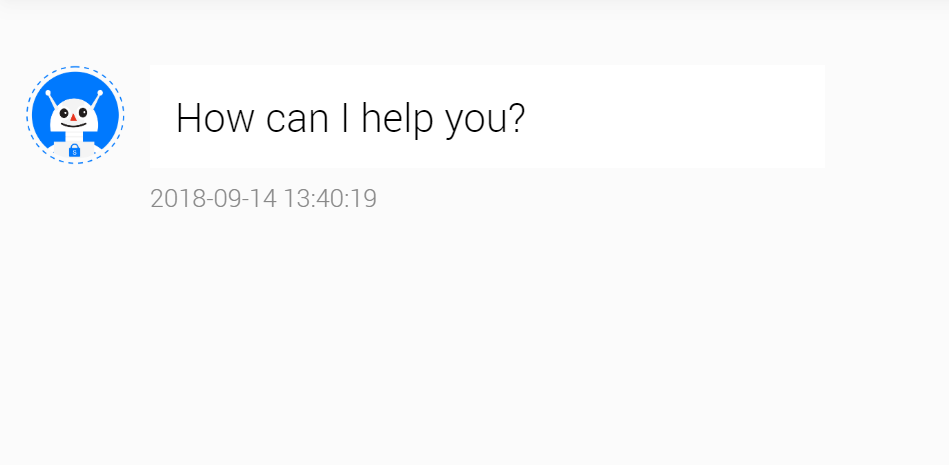
Design 1

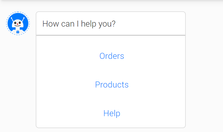
Design 2
Starting the bot with an open-ended question such as "How can I help you?" is generally not recommended. If your bot has a hundred different things it can do, chances are users won’t be able to guess most of them. Your bot didn’t tell them what it can do, so how can they possibly know?
Menus provide a simple solution to that problem. First, by listing the available options, your bot is conveying its capabilities to the user. Second, menus spare the user from having to type too much. They can simply click. Finally, the use of menus can significantly simplify your natural language models by narrowing the scope of input that the bot could receive from the user.
Tip
Menus are a valuable tool when designing bots for a great user experience. Don’t dismiss them as not being "smart enough." You may design your bot to use menus while still supporting free-form input. If a user responds to the initial menu by typing rather than by selecting a menu option, your bot could attempt to parse the user's text input.
3. Rich user controls
Rich user controls are common UI controls such as buttons, images, carousels, and menus that the bot presents to the user and the user engages with to communicate choice and intent. A bot can use a collection of UI controls to mimic an app or can even run embedded within an app. When a bot is embedded within an app or website, it can represent virtually any UI control by leveraging the capabilities of the app that is hosting it.
For decades, application and website developers have relied on UI controls to enable users to interact with their applications. These same UI controls can also be very effective in bots. For example, buttons are a great way to present the user with a simple choice. Allowing the user to communicate "Booking" by clicking a button labeled Booking is easier and quicker than forcing the user to type "Booking." This especially holds true on mobile devices, where the clicking is greatly preferred over typing.
When designing your bot, do not automatically dismiss common UI elements as not being "smart enough." As discussed previously, your bot should be designed to solve the user's problem in the best/quickest/easiest manner possible. Avoid the temptation to start by incorporating natural language understanding, as it is often unnecessary and just introduces unjustified complexity.
4. Use Custom Error Message
The «Custom Error Message» is like the «Error Page» of your website for your bot users. This message is shown if your bot repeatedly cannot parse a user's input.
Watch this video tutorial "The main principles of the chatbot design"
Updated over 4 years ago
