Rich cards
Cards are a neat way of embedding images, gifs, videos and calls to action in a bot message. Cards make a conversation look more user-friendly and visually rich.
The SnatchBot platform supports four Card types:
| Card type | Description |
|---|---|
| Text Card | A card that can contain any combination of text and buttons. |
| Image Card | A card that can contain just an image, without buttons. |
| Gallery Cards | This element is a set of cards, each of them can contain any combination of text, images and buttons. The display may vary depending on the channel (e.g. Facebook displays in one row, Skype as a column, while Viber shows no more than 6 elements per row etc.). |
| RSS Card | Learn more |
Text Card
A text card is a combination of text and buttons. Users are able to interact with cards during the conversation. For example, a user can jump to another interaction, open links, make phone calls, make purchases and open emails.
Learn more about Card Buttons.
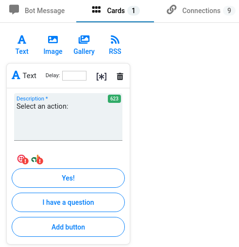
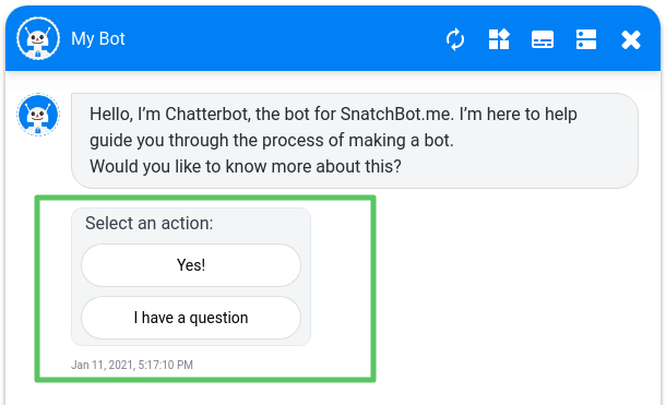
How a Text Card looks in the Test chat:
Note
The maximum length of the Description field varies depending on the channel:
WebChat (Test Chat, Preview, iFrame), Email, Telegram, Slack, WhatsApp - 640 chars.
Line - 60 chars.
Viber - 250 chars.
Facebook - 80 chars.
Skype - 180 chars.
Twilio - not supported.
Africa’s Talking - not supported.A text card can only contain a maximum of three buttons. The maximum length of the name of the button is 20 characters.
Image Card
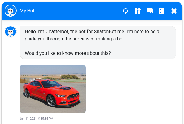
This card is used for displaying an image.
All the images you have previously uploaded are available for selection.
How an Image Card looks in the Test chat:
Gallery Card
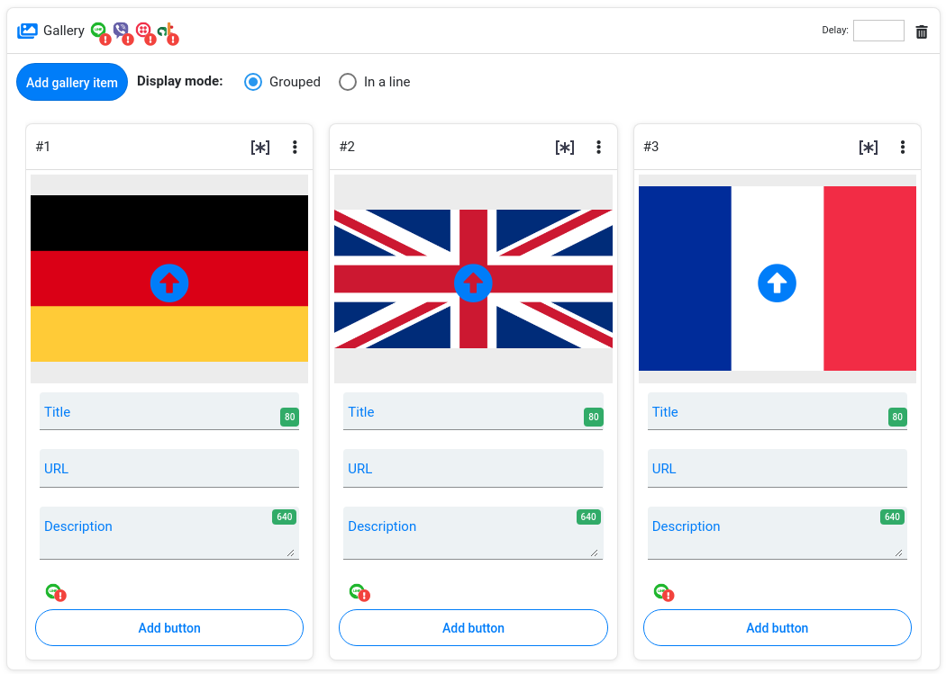
A gallery card is a set of several images and their description in one card. You can add up to 10 images in a Gallery Card and up to 3 buttons under each image. Images in a gallery can be grouped or set in a line:
Note
To use the “Display in one line” option in the Line channel, make sure you have filled in all the fields and added at least one card under each button. Also, the amount of buttons under each item must be equal in order for them to be displayed correctly in Line.
Viber has a fixed height of the gallery: the more buttons you have, the less space will be available for the picture. Test your bot in Viber before publishing.
Cards layout and functionality view may vary depending on the channel.
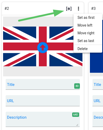
It is possible to change the order of the elements in the Gallery without having to delete the Gallery and create it again:
Using Attributes and Custom variables in Cards
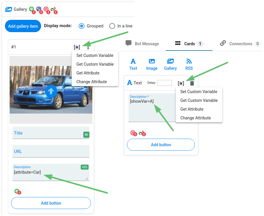
You can use Attributes and Custom variables in the Description field in Text and Gallery Cards.
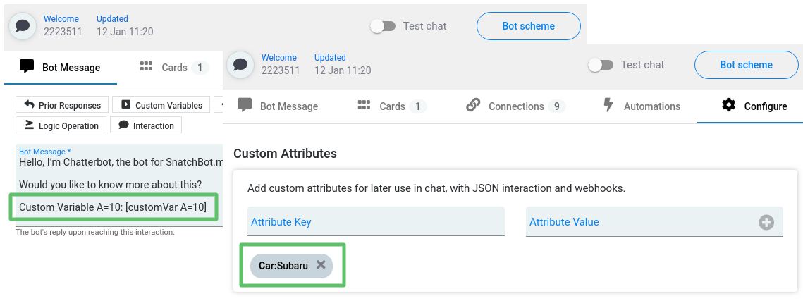
Assume you have set a Custom Variable "A" and the Attribute "Car" in the interaction 1:
You can display these data in the Description fields of the Text and Gallery Cards in the subsequent interactions. To do so, click the asterisk button and select the command from the drop-down list:
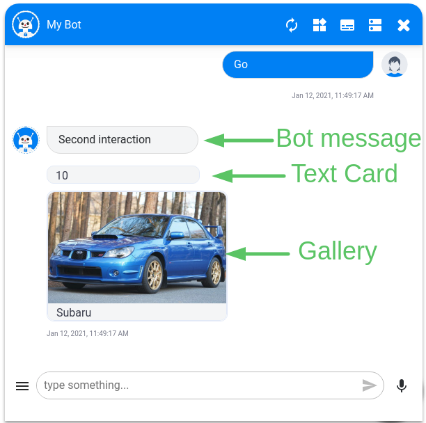
Here is how it looks in the Test chat:
Watch this video tutorial "Types of Rich Cards"
Updated almost 4 years ago
