Customizing the look of your chatbot
A guide to customising the bot's appearance, to match a brand colour scheme.
You might well want to customize the way your chatbot looks on the webpage. Perhaps you have a business and the exact brand colour scheme is important to you.
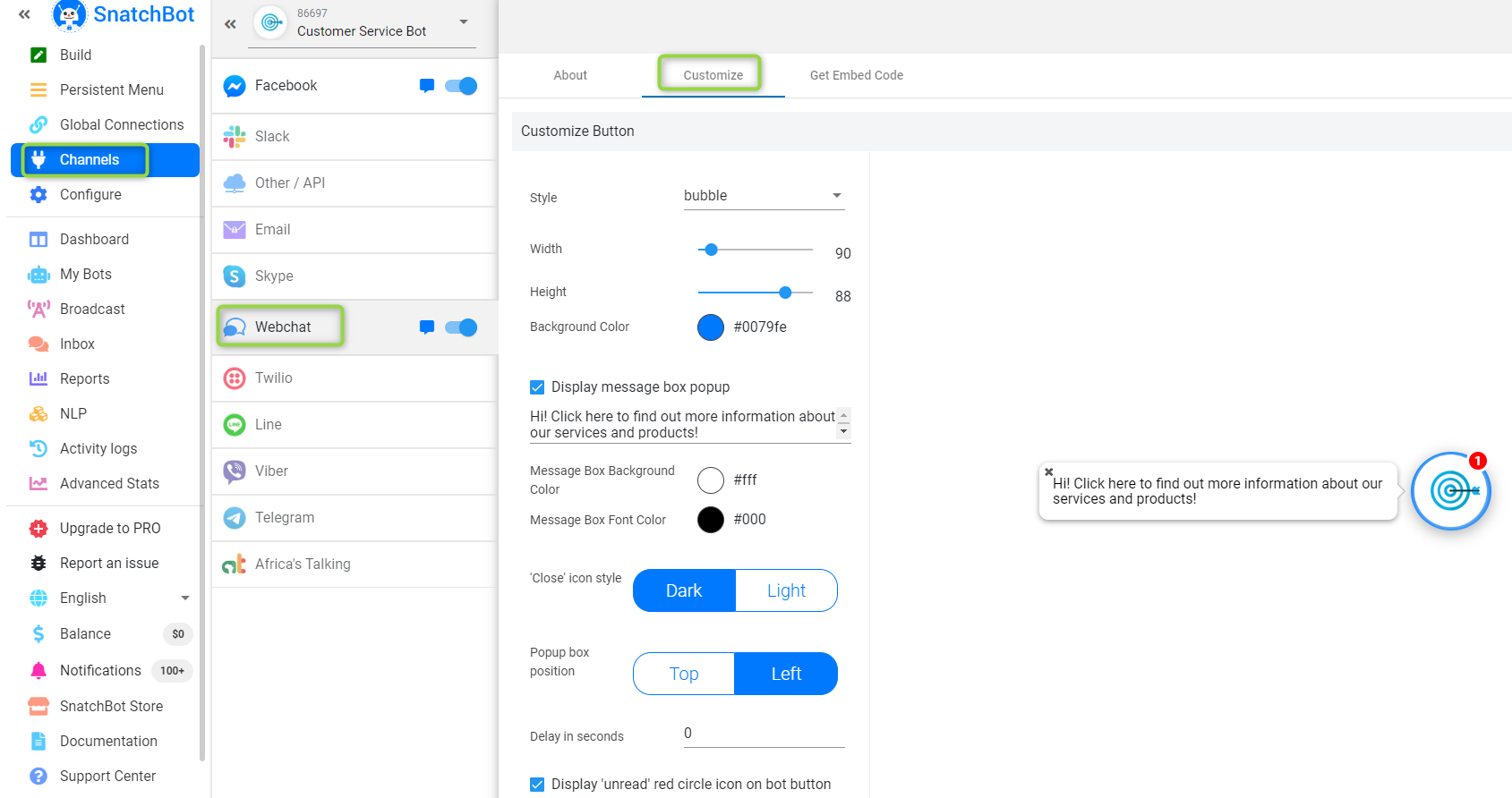
It’s easy to do so. Select your bot, choose Channels and then click Customize.

It is possible to customize the following options in a Button:
- Style of the button (bubble, rounded, rectangle). There are additional options for the Rounded and Rectangle styles:
Show Icon - shows / hides the icon of the bot. If the icon is hidden, the background color will be displayed.
Button Label - custom text, maximum 20 characters
Label Color - the color of the custom text
Label Size - the size of the custom text
Label Weight - the thickness of the custom text
Label Style - the size of the custom text (Normal / Italic) - Width and height of the icon
- Background color
- Display/hide message box popup. You can edit different settings of the popup:
Text of the message - bot message, maximum 500 characters
Message Box Background Color
Message Box Font Color
Style of the “Close” button (Dark / Light). This button appears when you hover the mouse over the popup box.
Popup box position - position of the popup bubble relative to the bot icon (top / left)
Delay in seconds - the time in seconds, after which the message box popup will appear. The range of available values is 0-120
Display/hide “Unread” red circle icon on the bot button - shows the number of unread messages.
To apply changes press the Save button at the bottom of the tab
The editing screen allows you to customize the appearance of your bot button (and add a label) but crucially all the colors of the text box along with the banner are fully adjustable. You can either use the color rectangle that pops up when you click on the respective buttons, or, for the exact shade you want, enter your HTML color code.
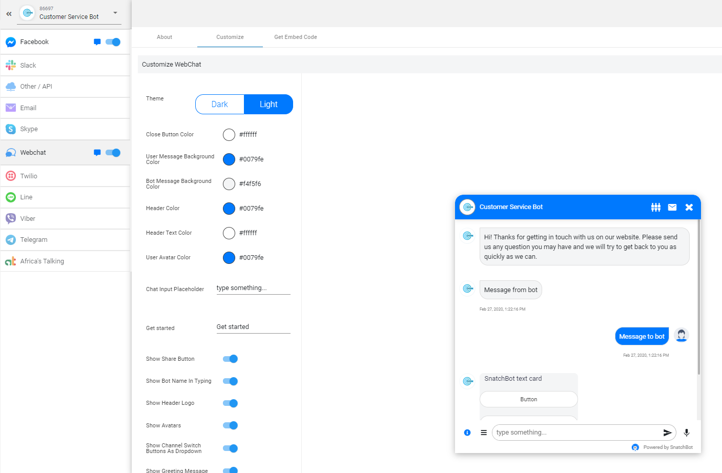
It is possible to customize the following options in a Webchat:

The available options are:
- Theme - the theme of the chat window (Dark / Light)
- Close Button Color
- User Message Background Color
- Bot Message Background Color
- Header Color
- Header Text Color
- User Avatar Color
- Chat Input Placeholder - the default text, which is in the input field.
- Get started - this button appears each time a user launches the Webchat. Upon being pressed the Webchat opens. Here you can change the name of the button (0-30 characters).
- Get Started Button Color
- Get Started Button Font
- Start screen text and fields color
- Show Header Always
- Show Share Button - shows / hides the Share button in the header. Upon being pressed, the device mail client launches.
- Show Bot Name In Typing
- Show Header Logo
- Show Avatars
- Show Channel Switch Buttons As Dropdown or show all the buttons right in the header.
- Show Greeting Message - an additional message which will be sent by a chatbot in the beginning of the conversation.
- Greeting Message
- Reset - applies default settings. Upon being pressed, the confirmation window appears: “Are you sure you want to reset webchat settings to default?”
- Preview - opens preview chat.
- Save - saves the changes
Font customization
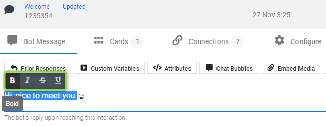
You can apply a custom style of the text of the bot message (bold, italic, strikethrough, underline). To do so, highlight the relevant text in the field and select the desired style from the pop-up menu

This feature does not work on Telegram.
Watch this video tutorial ''How to Customize the look of your chatbot'
Updated almost 4 years ago
